Fusion of Color Bright collection!
I follow Fusion of Color Cosmetics on facebook, and I saw that Kathy had released a new collection, Brights. Obviously, bright colors are the best. Obviously, I ordered sample sizes of all six shadows from the collection. And obviously, I have swatched them here for you today! If you weren't bowled over by my Fusion of Color Review, due to the more neutral shades they offer (gorgeous, but neutral), this collection is for you my friend. SIDE NOTE: I know bright/rainbow collections are always a warning sign of repackaged TKB Pops, but as I said in my review, Fusion of Color does not repackage. You can tell from my swatches these are not TKB Pops, and it's even more obvious in person.
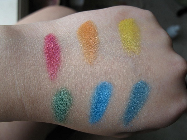
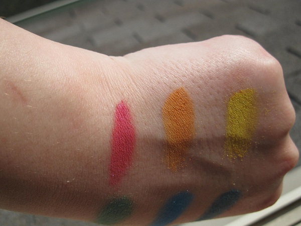
All applied over Concrete Minerals primer.
Top row: Hottie, Blaze, Canary
Bottom row: Midori, Out of the Blue, Evening Sky
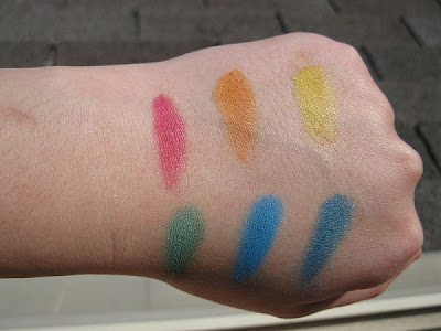


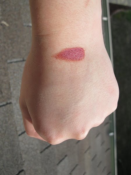
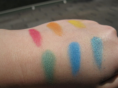 I couldn't capture all the gorgeous shimmer these colors have. My favorites would have to be Hottie, which is a real blue based pink (irl you can see some purple-blue shimmer to it), and Evening Sky, which is a complex teal.I also ordered a sample of the diamond finishing powder, which I have swatched on my hand here with my free sample that was included, Glori. It's hard to see because it is so close to my skintone, but I love how it sparkles a little in the sunlight. :)
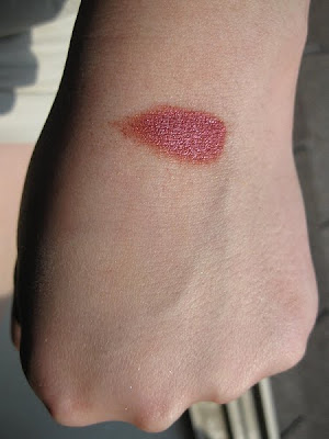
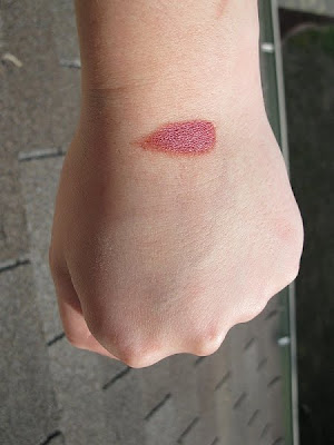 I don't see Glori on the website, but it is a gorgeous red with some pink in it.So, if you are looking for some gorgeous, simple, bright & beautiful eyeshadows, I say go for these! Samples are $1.65.


Woah those are bright!!!
ReplyDeleteVery pretty! I may have to check Fusion of Color out now... :)
ReplyDeleteNiiice! Thanks for the great swatches! I really like Fusion of Color, and I'm adding these colors to my wishlist. :)
ReplyDeleteOut of the Blue looks so sweeeet!
ReplyDeleteWould you say these are beyond basic pop colours? They look pop based but its hard to tell if they are adapted enough to not be repackaged from here.
ReplyDeleteLovely swatches. Hottie and Canary look great.
ReplyDeleteThe TKB pops have corrupted me (and probably everybody else) D: not cool that I now associate anything rainbow with lameass repackagers.
ReplyDeleteBut these look really pretty! :D love the look of the bottom row
I know the feeling - I see primary colours and freak out. I know someone can have these colours and do more. Just worry so much.
ReplyDelete@Kira:I don't have any pops to compare, but just from my general knowledge, I'd say the blue and orange are probably pops based (maybe the others, but these are the most obvious). The yellow is too "primary" and not the kind of "soft" yellow the pops have. The green and teal are definitely not close to any pops colors. The pink might look like a pops color here, but irl it's more complex, definitely not just a repackaged pop color.
ReplyDeleteI haven't swatched my Pop samples yet (even though they've been waiting there for ages...) but I'm starting to feel dubious about these colours as well, like other commenters have said. But Midori and Evening Sky don't look like any of the Pop colours, at least. With the others, I don't think I know enough to tell XD They're all pretty, though!
ReplyDeleteSnap! Hottie looks like a nice color. :)
ReplyDeleteRandom question, what's your favorite color?? In general. :)
NIice! i always love your makeup hauls
ReplyDeleteOh, I like Hottie and Glori! Will definitely have to check out Fusion of Color. Thanks for the swatches!
ReplyDeleteDang! Those are bright!
ReplyDelete